
Sometimes it seems like there is an almost weekly occurrence of New Zealand being “left off” a world map somewhere.
Indeed this 2017 article from the UK’s Telegraph even lists a top 5 New Zealand map omissions (including the time a New Zealand government department website left New Zealand off a world map!). While the list and article is largely tongue in-cheek, as was the popular Tourism New Zealand promotional video with Rhys Darby and Jacinda Ardern that followed, it is clear that this phenomenon happens regularly enough to give us pause for thought.
What’s behind it? What could explain it? Is it some dark conspiracy…??
Well, there could be a couple of factors at play here, I think. Firstly, we have to start with cartographic (or map) projection which can be summarized as:
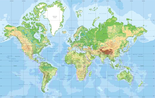
There are a number of different map projections, but the one most relevant to this question is the Mercator projection.
Devised by the Flemish geographer and cartographer Gerardus Mercator many centuries ago, this projection eventually became the gold standard for maritime navigation.
Without getting too technical, the Mercator projection is a cylindrical map projection (which shows north as up and south as down and maintains the shape and direction of land masses). No doubt useful for old-time maritime navigators, however, an inconvenient side effect is what is known as “geographic inflation” which inflates the size of land masses the further they are from the equator.
This creates visual distortions and is why Canada and Russia (for example) look so much bigger than they actually are. They are big countries, of course, but you’d be forgiven for thinking (with the Mercator projection) that Russia was bigger than Africa (which it categorically is not).
Secondly, as they are essentially a communication medium, maps are not immune to the chill effects of geopolitical propaganda. The USA during the Cold War produced numerous maps that took advantage of the Mercator projection’s distortionary effect to overstate “the red peril” and the encroaching threat of communism. One famous example being the Communist Contagion map published in Time magazine in 1946, showing the spread of communism as akin to some fast growing and terrible disease.
Could it be then that there is some dark conspiracy to remove New Zealand from the collective consciousness? Some form of shadowy geopolitical propaganda?
Well, no, probably not. Even with the distortions of geographic inflation New Zealand is not a large or influential country, and it’s not of huge strategic importance to the great world powers either.
The key reasons are likely to be a little more prosaic. A mixture of the historical popularity of the aforementioned Mercator projection (and its Eurocentric view of the world) and the way our brains are programmed to engage with certain elements within our visual field when processing visual information.
When cartographers “flattened” the globe’s surface into a plane to make a map (using the cylindrical Mercator projection) this put New Zealand firmly at the bottom right of the map.
Now, as any decent photographer or designer (or psychologist working in sensory perception) will tell you, the bottom right of any picture, graphic (or visual field) is pretty much dead space. It’s not where you put your website’s “buy now” button and if you have to crop an image that’s probably where you’d start.
So, with all that in mind, perhaps it’s time for a collective campaign by the Pacific nations to promote a new version of the Mercator projection, one centred on the Pacific Ocean instead of being centred on 0 W and the Greenwich Meridian? This could have the advantage of focussing the world on the region most likely to be impacted by sea level rise as a result of ongoing climate change too.
See the difference below in a "reimagined Pacific-centred Mercator projection" in comparison to the standard "Eurocentric Mercator projection" at the top of this blog.
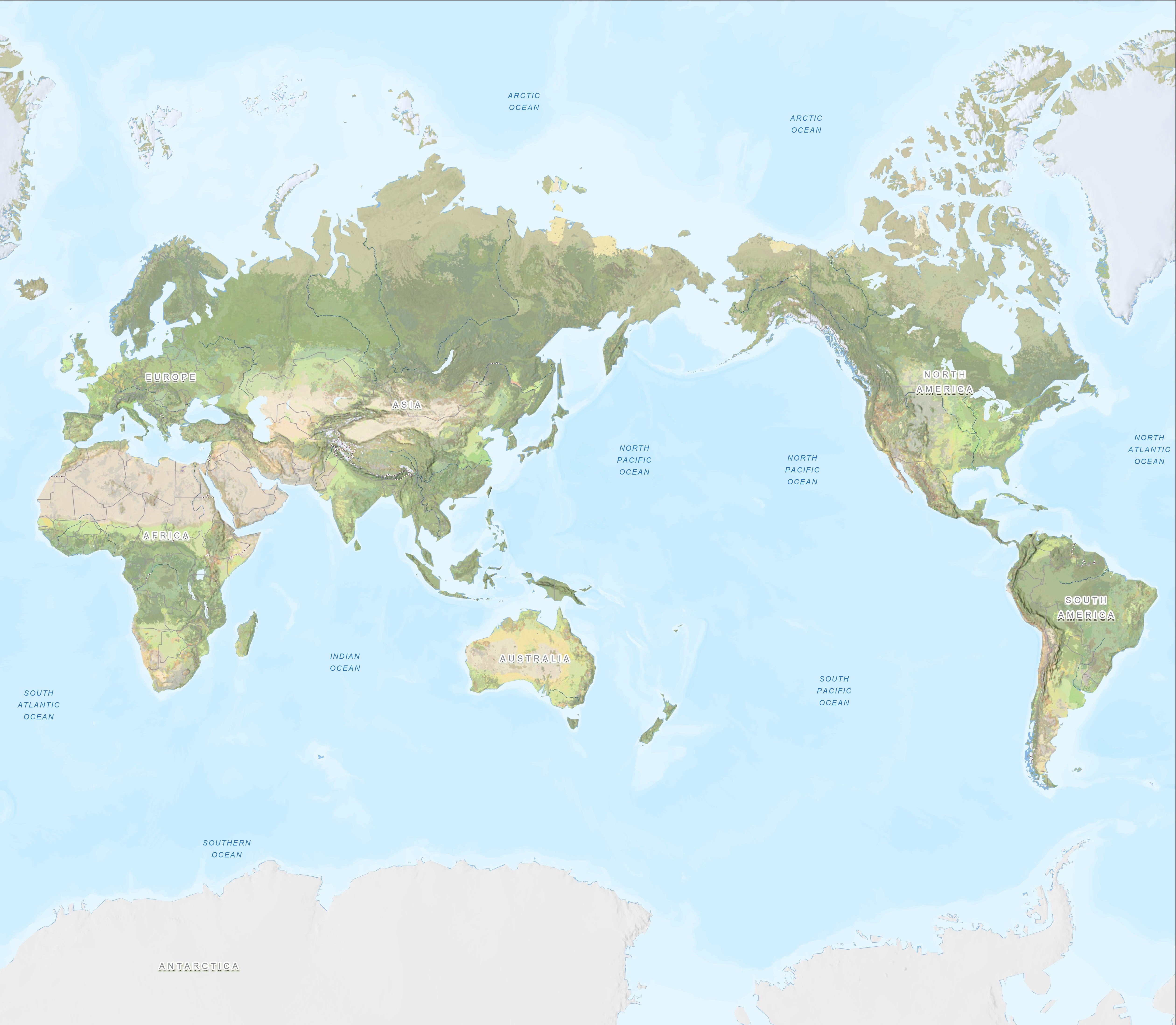
Sources: Esri, USGS, FAO, NOAA
Either way, the unexciting truth as to why New Zealand is so easy to leave off world maps probably has more to do with an ancient Flemish cartographer and visual perception (along with our lack of geopolitical importance) rather than some dark labyrinthine illuminati plot.
Or does it…?