For the second blog in our series on the relationship between people and their proximity to amenities (for which we use one or more of our extensive points of interest POI data sets) we have focused on retirement villages and resthomes.
Now, most of us probably have a retirement plan of sorts, or at least an idea where or how we would like to retire. Even if it is a vague concept (for those of you young enough for it to be a suitably distant proposition…) people usually talk about retiring somewhere warmer, somewhere sunnier and by the sea.
Perhaps unsurprisingly, our data would tend to support this comforting notion of where many of us will spend our twilight years.
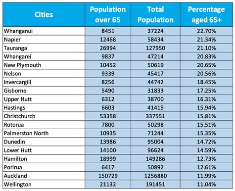
Firstly, when we look at the percentage of people aged 65+ living in our major cities there’s no show-stopping surprises in the top 5 destinations for retirees:
- Whanganui
- Napier
- Tauranga
- Whangarei
- New Plymouth
That said, the good folk of Tauranga might feel slightly miffed that they have been pipped by Whanganui and Napier in this measure (given the level of media coverage positioning Tauranga as New Zealand’s most obvious retiree destination). And, I’ll also concede that Whanganui coming in at number one was probably a little unexpected…
When it comes to Wellington and Auckland though, they have the lowest percentage of people aged 65+, which perhaps indicates that we tire of city life as we age..? Or perhaps more likely, we tire of the expense of city life and treat the capital accrued in the houses bought in these main centres as a retirement fund (by then moving to the regions where property and living costs are cheaper).
Percentage of population aged 65+ by city
Number of retirement villages per 1000 people aged 65+
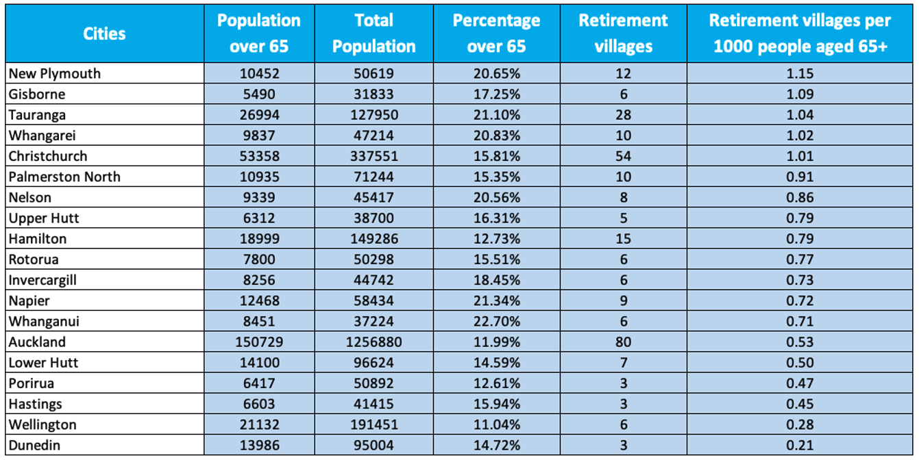
The ratio of retirement villages to people aged 65+ seems to support the notion of people wanting to retire somewhere warmer, sunnier and by the sea. Gisborne, Tauranga and Whangarei all rank highly on this metric, with New Plymouth coming out on top with the most retirement villages per capita aged 65+:
- New Plymouth
- Gisborne
- Tauranga
- Whangarei
- Christchurch
Retirement village data also indicates that people seem generally keener to retire to smaller regional towns too, with the main centres of Wellington and Auckland again ranking low on the ratio of retirement villages to people aged 65+ measure.
Christchurch bucks this trend a little, ranking 5th. This would indicate that the city is a reasonably popular retirement location, or perhaps it’s because the city’s housing is generally a little more affordable than Auckland or Wellington (and that more people living in Christchurch therefore choose to stay and retire there).
One way to view the data would be that Wellington and Dunedin have a real shortage of retirement villages for their population. However, given their low rankings on percentage of population aged 65+ in addition, it is probably safe to say that not many people are actively choosing to retire in Dunedin or Wellington.
Number of resthomes per 1000 people aged 65+
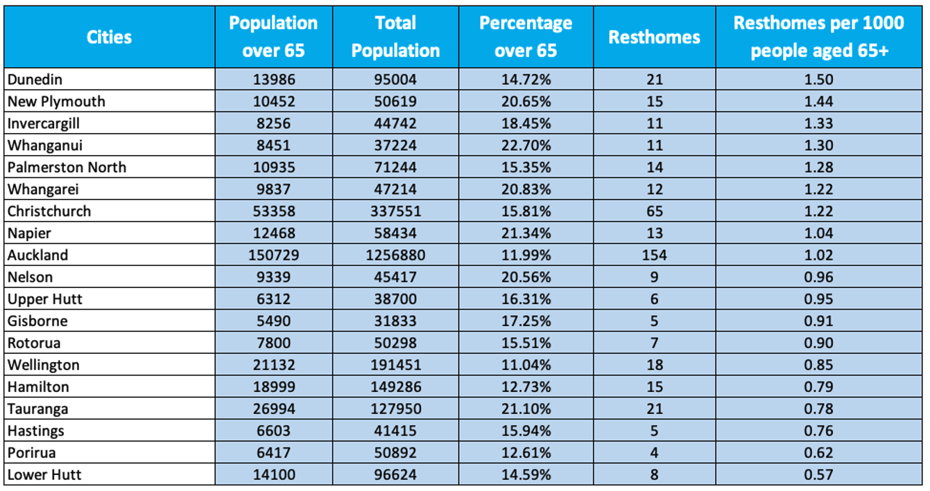
Interestingly though, Dunedin actually tops the list for most rest homes per capita aged 65+ (while simultaneously being bottom for most retirement villages per capita aged 65+).
Generally, the differences between cities for number of resthomes per capita aged 65+ are much more evenly distributed than the starker differences between cities on the number of retirement villages per capita aged 65+.
There are presumably some market forces at play here with respect to the major retirement village brands generally being operated as for-profit ventures by the private sector (so more likely to “follow the money” and cluster in trendy/desirable locations).
Contrast this to stand-alone resthomes that tend to be run as not-for-profits (or are publicly funded as a healthcare alternative) for those where the pricier retirement village lifestyle/continuum-of-care model is financially out of reach. In this context it makes some sense that resthomes would be more evenly distributed across the country rather than clustered in trendy (more expensive) hotspots.
To illustrate this, three (not naming names!) of the top five cities with the most resthomes per capita aged 65+ are not destinations you would traditionally expect people to choose to retire:
- Dunedin
- New Plymouth
- Invercargill
- Whanganui
- Palmerston North
It should also be noted here that many retirement villages contain a resthome unit within their facilities and that these resthome units are included within the total resthome counts for each city/area.
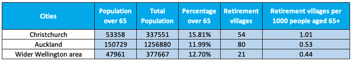
Main Centres comparison - Number of retirement villages per 1000 people aged 65+
Main Centres comparison - Number of resthomes per 1000 people aged 65+
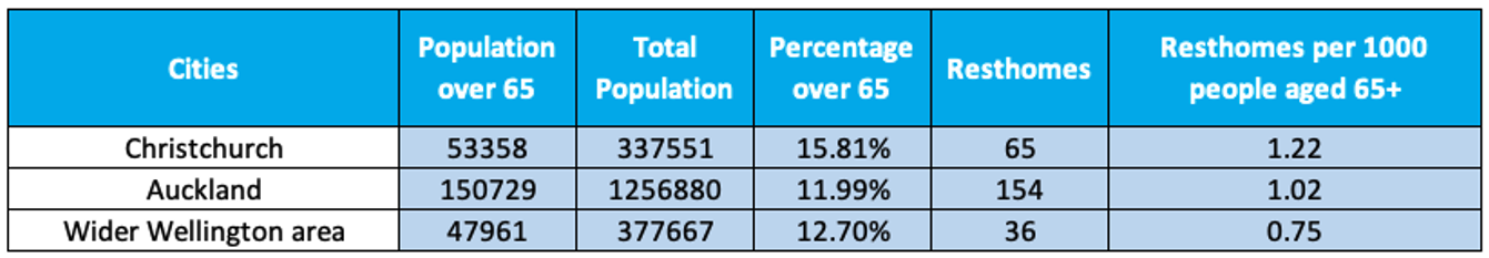
When comparing the Wider Wellington (Wellington, Upper Hutt, Lower Hutt, Porirua) figure with the other main centres (Auckland and Christchurch) many differences are not quite so pronounced.
In general, all differences between the main centres (Auckland, Wider Wellington and Christchurch) are less pronounced than between the rest of the country (or between main centres versus regional cities).
It is worth mentioning too that the Wider Wellington figure here does not include the Kapiti Coast region. Most Wellingtonian’s know that once their fellow residents hit 65+ a significant number of them head over to the Kapiti Coast (which is just up the road) to retire. Indeed over 28% of Kapiti residents are aged 65+, a significantly higher percentage of those 65+ than any of the cities listed in the main Percentage of population aged 65+ by city table above.
The Kapiti Coast District has 10 retirement villages and 12 resthomes contained within its boundaries, which calculates to about 0.75 retirement villages per 1,000 people aged 65+ and about 0.91 resthomes per 1,000 people aged 65+.
In summary, the data does seem to support the notion that most people aim to be somewhere warmer, sunnier, smaller (and by the sea) to spend their retirement and twilight years. There’s also clearly a handful of popular “twilight zone cities” that attract retirees and will likely need to respond by building suitable infrastructure to meet their demographic destiny.
The high-level data presented here can provide some directional indicators as to where to focus attention. However, urban planners, geospatial practitioners and other decision-makers interested in the richer kinds of insights NationalMap and its POI data can provide should feel welcome to get in touch and discuss their requirements.
N.B. The population data is taken from the 2018 Census. in addition, for the purposes of this blog we don’t discuss the capacity of villages or resthomes, ie the number of people in each facility (for example one retirement village complex could cater for 1,000 people across apartments, villas and rooms and another could cater only for 80 people). However, for those interested in total current capacity or populations contained in each of these facilities, I’d direct them to our Emergency Management basemap. This resource not only captures and maps all the retirement villages and resthomes across New Zealand, but also appends a total resident number to each facility.